Apr 2020
Hack the Crisis Sweden
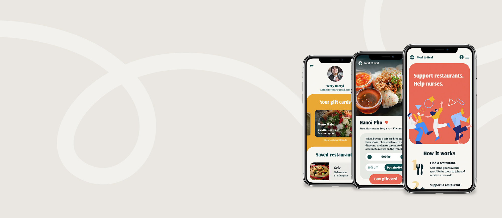
A web app designed and developed in 48 hours for users to support small local restaurants during the pandemic.
Context
Hack the Crisis is the official COVID-19 hackathon initiated by the Swedish Government. The intensive 48-hour hackathon with more than 7000 participants was carried out exclusively online, aiming at gathering creative ideas and develop concepts helping us make further progress in the ongoing resistance.
My team chose the brief save businesses, finding new revenue streams for local businesses on a tight schedule, and ensuring that the aftermath goes smoothly.
Project duration
2.5 days
Key Skills
UX/UI design
workshop facilitation
user journey mapping
video editing
My Role
UX/UI designer
* I have revamped the project after the hackathon.
Our Solution
Provided with the open-ended brief, we identified the possibility of creating an easy-to-implement gift card system for smaller restaurants to their frequent diners. The result is Meal to Heal: a mobile-based gift card app that lowers the barrier to selling and buying restaurant gift cards, while helping medical professionals on the front line.
Building a team + a process
Since this was an online hackathon, I took advantage of the official Slack channel to gather a team of five, with members in different parts of Sweden and with very diverse expertise.
To get to know each other and start thinking about a solution, I designed a two-hour team-building session, where we talked about our individual goal for the hackathon, and aligned on the timeline and mini-milestones.
Ideation
#1 Mashup
We laid out as many items as possible under three broad, unrelated categories - technology, existing services, and human needs under Covid-19.
Then, picking one item from each category, each person generated one idea using all three items. We repeated this until we had about 20 ideas in total.
#2 Impact and effort matrix
After we presented our ideas to the group, we discussed them while clustering similar ideas and prioritizing them on a 2 x 2 matrix based on return and investment. The ideas closest to the top left corner (high impact, low effort) of the matrix became our finalists.
#3 Dotmocracy
To make an efficient decision, each person got two dots to place on their favorite ideas; the idea with the most votes was our winner.
Almost all of us connected to the idea of developing a plug-and-play platform for small, local restaurants, so people that want to support them can easily buy meals in advance to help them through the crisis.
Research
With an idea we wanted to proceed with, we needed to validate that it has business value and is technically feasible. I divided all research topics for the team members to deep-dive into before we defined our solution further.
We then synced and looked through our research insights; based on those, we defined the potential USP’s for our solution, including Swish implementation, extra reward for supporting restaurants, and social sharing functionalities for crowdfunding, etc. These helped us develop our idea further in the next step.
User journey mapping
With many possible directions to take our solution and potential misinterpretation from the team members, I wanted us to be aligned on which features would be in the MVP version that we design and develop. To do this, I designed and facilitated a customer journey mapping workshop, where the team visualized a customer’s experience using our product.
The workshop brought the team to the same page and gave the designer and developers a solid foundation to continue working on.
Wireframe sketches
I quickly drew out some sketches based on the MVP functionalities; this became the basis of the high-fidelity prototype I created later, and enabled the developers to proceed with their work.
At this point we were also able to chat with a mentor in the hackathon channel; he liked the idea of making supporting restaurants by purchasing meals in advance, but felt like the app lacked something a USP or something that sets it apart from potential competitors.
After the chat with the mentor, the team brainstormed again to iterate on the functionalities. Our decision was that, when a user got a gift card for more than three meals, they could select from 1) receiving a discount, and 2) donating the discounted amount to medical personnel on the frontline.
This also helped us decide the name for our app - Meal to Heal, for which I designed a simple logo and visual identity to use when making the high-fidelity prototype.
High-fidelity design
Since I only had a couple of hours to work on the high-fidelity design, I focused on clear instructions to ensure usability, and vibrant colors to create positive emotions. I also included nudges in the copy that give users a proactive mindset and help them build confidence.
Delivery
Parallel to my work on the high-fidelity prototype and the developers’ work, our project manager compiled our pitch for the final deliverable, which included a problem and solution description, tech description, and an action plan.
They clarified our solution even more and helped the team navigate disagreement on details, and also guided me through the process of making the demo video.
Reflections
Hit the ground running with a new team
This was my first time building a team from scratch with people that were complete strangers, and it was early in the now-familiar work-from-home new normal.
Looking back, I was still figuring a lot of things out - including how to utilize Miro for collaborative sessions, and how to facilitate remote team-building activities.
What helped was to set up the structure from early on, to be proactive in asking questions to make sure everyone’s on the same page.
Plan quick and dirty check-in’s during the process
The Hackathon process is very much constrained by the time pressure - a small misunderstanding could lead the process astray. Before we started, I aligned everyone’s availability and created a simple timeline, with mini-milestones and meetings marked. This ensured that we kept adapting and prioritizing - both our product and our way of collaboration - according to the team’s vision and resources.
Potential next steps
As smooth as the prototype looks, a lot of assumptions were made during ideation and production, assumptions that we did not have time to validate or test. If I was to take this project further, I would create personas based on market research and interviews, and use them to break down the journey in finer granularity, and user test the features under respective scenarios.


