
Sep - Oct 2019
ICA SmartPay
Revolutionize ICA’s self-checkout system, from strategy to interfaces
Team
Tian Gan
Micky Algeborg
Ezequiel Almonacid
Adam Landberg
Emma Kling
My Roles
user interface design
user experience design
user research
design strategy
* The project has been revamped by me in 2020.
Key Skills
concept ideation
field interview
interaction design
visual design
high-fidelity prototyping
Context & Challenge
ICA Gruppen AB is one of Sweden’s largest retailers of food and health, operating about 1,300 stores of various product ranges and sizes.
ICA launched its self-scanning and checkout service 10 years ago and it has been hugely successful. However, since each store is owned and operated separately, they have different customer journeys and touch points as well as a vast range of customers, and the process has never been fully worked on.
Our brief was to build a new self checkout flow that increases speed and customer satisfaction, and harmonizes the ecosystem.
Our Process

Competitive
Analysis
We first looked into the food retail market to examine existing self-scanning and -checkout systems; we also interviewed staff member and managers at competitive stores.

We found that:
Some of competition’s processes have significantly fewer touch points and are consequently more efficient to use.
The possibility of random staff checks is a common pain point for customers.
Self-scanning and -checkout free staff to better manage the floor and improve the shopping experience for the store.
Therefor, we hope to create a system that has decreased touch points, making the whole process more efficient and intuitive and improving customer satisfaction.
Field
Interview
Together with a team member I conducted a semi-structured interview at ICA Kvantum Sickla to:
dig into current users’ pain points and
gain perspective from staff with long-term experience working in the self-checkout area.
I created the questions we asked in the interviews, kept the interviews informal and the follow-up questions open-ended to give the interviewees space to reflect and elaborate.

We interviewed 2 employees and around 10 customers, age ranging from early 20s to 70s, right after they used the self-checkout system. After the interview session, I delineated the different needs for staff and customers, and used the insights to guide our design choices.

Ideation
With our research insights in mind, we embarked on the ideation phase, using Method Kit as our main tool. I encouraged my team to come up with as many ideas as possible without worrying about feasibility at this stage.

We then went through the ideas and discussed their implementation feasibility as well as potential impact for our client. We shared out thoughts on each one of them and I facilitated a session where we pinned down the ideas on a feasibility/impact matrix.
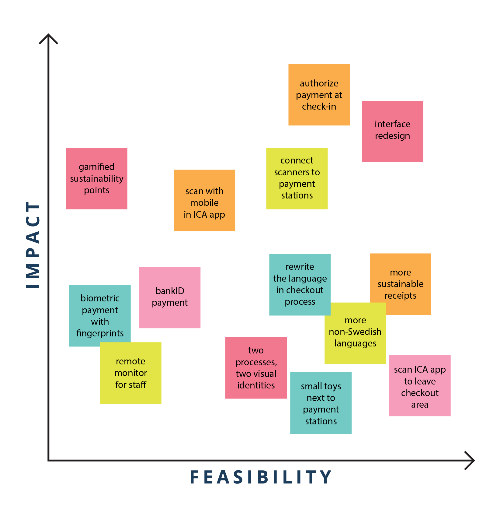
When discussing these solutions we came to realize, for example, that we were gravitating towards more innovative processes that directly involved the majority the end users or customers using self checkout. Therefore, we took out some solutions including biometric payment with fingerprints. We also identified solutions that can be combined for a more holistic deliverable.
Eventually, we settled on the three solutions on the top right corner of the matrix for which we wanted to build low-fidelity prototypes.
Lo-fi Prototypes
1. User interface re-design
The idea is simple: to minimize screens and create an interface that is clear, intuitive and easy to use for customers of all age groups and computer-literacy levels.
This solution would potentially be combined with the possibility of customers getting receipts and purchase details in their phones, minimize the need to print paper receipts.

My sketch of the new self-checkout interfaces
2. Connect handles to payment stations
I took the initiative to sketch out the user flow for the second solution, which is to connect payment stations to scanning handles. This would mean that when a customer returns the scanning handle into the dock, details of that purchase would be sent directly to a payment station designated for this customer’s checkout.
This solution felt intuitive to us since the handle and the payment station were in the same perceived system of the shopping journey; having to take out the ICA card for authentication at the payment station made the shopping flow feel interrupted and fragmented.

3. Move checkout to check-in
Our third solution was a deconstruction of the existing checkout flow: we want to give customers the option of authorize payment already when they pick up their handles; this way, the payment part of their shopping journey will be considerably shorter, since they can finish shopping and leave the store without making the stop at the payment stations.
Since this is possibly the one with most technical complexity, we divided the prototyping into two parts. My responsibility was to make a user flow that covers the whole shopping journey, while my teammate focused on developing different iterations for the future versions of the products.

Choosing
a Solution
After a round of discussion and another meeting with ICA’s product design team, we decided to move forward with prototype #3 for the following reasons:

Design Principles
To capture the essence of the product, I wrote a set of design principles and made sure we kept those in mind during the next phase of design and development.

High-fi Prototype
I was responsible for designing the first iteration of the high-fi prototype. This process would take the user from the tablet at the handle station seamlessly to the handles where they would go through the shopping and payment journey.
My primary goal was to validate whether the design saves time in the user journey, provides information needed along the way, and increases user satisfaction. I also hoped to conduct usability testing so I can make improvements.
I used Adobe XD to make this basic interactive prototype to illustrate basic functionalities for us to test the hypothesis.

Evaluation &
Iterations
Usability Testing
Taking the goals I had in mind for this iteration, I designed two scenarios for the usability testing session: one being when the user has money charged in the ICA membership card and would like to try InstaPay for the first time, the other being when a user has no previous knowledge or experience with InstaPay and is just exploring the interfaces.
My team took the prototype to another ICA store with self scan handles to
identify usability problems with our current design and
assess its learnability, especially for customers familiar with the existing process.
Feedback & Design Iterations
Users’ subjective feedback of the prototype indicated that despite the big procedural difference our product introduced, it is highly usable and learnable, and significantly shortens the time needed for checkout.

Further Steps
Our product’s core functionality reply heavily on users charging their ICA membership card with money. However, how can we enable them to pay with their bank cards, or even with biometric payment in the future? My group talked about a three step implementation plan (ICA card - bank card - biometric payment) in the ideation phase. Future research and testing is needed to prototype those iterations.
As for the current version, we would also need to test a fully functioning version with a much larger user base to find out what needs to be improved or altered to increase the usability and accessibility.
Reflections
Reason behind behavior
Designing for changing people’s well-established behavior is always tricky. It pushed me to think deeply about how to get genuine feedback from the users being tested, like how to formulate open-ended questions to find out the reason behind a certain behavior or reaction.
Design solution vs. tech solution
The process of building a new product for a company with such a wider customer base also made me reflect on the long-term roadmap of how team made sure the design solution is compatible with the current tech solutions. I think we made more conservative choices to choose those that fit better with users’ existing mental models. I’m not sure if this is the best approach for reconstruction the user journey, so I’d love to learn more and discuss about it.
Although we had the ICA team and their UX designers’ input through the project, but being isolated from the engineering team did mean that a lot of decisions we had to make relied on our intuition. However, we handed over the prototype and our test results to the ICA team for more internal discussion, while we were not in the project anymore.